Monday, December 30, 2013

Key Series

I haven’t been able to post anything in a while. Who would have thought that there are places in the U.S. where you can’t get Internet. I am now one of those people sitting in coffee shops on my computer.

We have recently moved across the country, and finding work has been more difficult than I first imagined. So unfortunately my studio time has suffered. I am currently working on making a studio space where I can continue working on my illustrations.

Until then, I thought I would post some older art work.

This series initially started out as sketches in my sketchbook, and were originally part of only one composition. I had spent so much time drawing and researching keys that I thought it would be a waste to make only one final product.


To create uniformity, I worked on all three of these at the same time. I had an old book that I took the pages out of and wrinkled up all of the pages. I then used a spray adhesive, sprayed my illustration board, and pressed all of the wrinkled book pages.


After the book pages were dry on the illustration board, I used a thin wash of matte medium gesso in the center of the boards. I wanted the keys to have a semi-blank background, but the surrounding to have the texture of the words on a page.


After I drew the keys in colored pencil, I applied a thin layer of watercolor. When the watercolor was dry, I sprayed a light layer of fixative, then another thin layer of clear matte medium gesso. I generally like to wait a day for the matte medium to dry before I put on the layer of oil. After the oil was dry, a light brush with some colored pencils show cased the texture of the background.

Tuesday, July 30, 2013

Moving across the country

I have been moving across the country, and have yet to set up a studio. I will be posting as soon as I have reliable access to the Internet, sorry for the lack of pictures and posts.

Monday, May 13, 2013

Future Astronaut

 
Future
 
When I was young, boxes were magical. With a little imaginative help, a box would turn into anything; a castle, fort and of course a space ship. Now I love letting kids use their imagination when playing. When you foster imagination at a young age, creativity blossoms and can be used throughout their school years, and beyond.
 

Wednesday, May 8, 2013

Tribute


Tribute
 
These three illustrators are some of my favorites, Maurice Sendak, Dr. Seuss, and Tim Burton. I used pencil, and watercolor to create the "snap-shots" of each illustrator to show their most iconic images. 

Tuesday, April 30, 2013

Farewell Alabama


My husband's flight training is winding down, and it is almost time to say "farewell" to Alabama. We have made several friendships that will be hard to leave, but it is always fun to have friends all over the country and the world. Good friends are hard to find, and we have been fortunate to find several.
 
We truly enjoyed our time here and will never forget Alabama!

Sunday, April 21, 2013

Training

Training
 
My husband had to leave for one of his many military trainings. While he was gone, I saw his boots and wanted to capture a simple memory of him.
 
When he was done with his training and saw the drawing, he asked me why boots? I had to think about it. Boots are what get you to and from where you need to go. While everyone looks the same in their uniform, (which of course is the point) the boots have a different wear pattern. I was going to re-work this drawing before posting, however when I went to grab his boots, they were his flight boots, and not the summer boots. They had a totally different wear pattern and look. Each of his many pairs of boots are different and are worn for different reasons, flight, summer, winter, and special training. 
 
I have come to understand so much more about the military in my short time as a military wife. I understand why everyone has to look the same; the same uniform, hair cut, and boots. It is hard to tell individuals apart, I didn't see my husband when he was standing three feet from me. He of course thought that was hilarious. When everyone is the same, or at least looks the same, you begin to notice the tiniest differences. For me at least, I notice the boots.

Wednesday, April 10, 2013

Urban

"Urban"
 
As busy as city life can be, everyone likes to get away every now and then. Sometimes the city life can be very oppressing. Each person has to choose their own path, and mine has definitely lead me out of the city, of that I am thankful.

Tuesday, April 9, 2013

Steps of a Mural Painting

 
Step #1
After meeting with my client; talking about what she wanted and envisioned and showing me some pictures, I came up with this sketch. I used a long/wide sketch because the client had said that the wall was 3'x6'. The client approved the sketch and I went to work.


Day #1
I prepped the wall, that included washing off the wall with a wet sponge and some dish soap. After letting the wall dry, I taped the edges. I then wet a sponge and added some gesso. The original wall did not have much texture to begin with, but the gesso wash that I added helped in filling in some of the texture. I also wanted to add the gesso wash to the wall to make sure the paint would stick. The gesso wash dried quickly and I sketched out in pencil what I was planning on painting. Pencil is much easier to erase and change than acrylic paint.
 
*Side note: I was talking to my husband and he asked how big the wall/mural was. I promptly and confidently replied, 3'x6. He said so about this big, and demonstrated on a wall. I looked at him, laughed and then demonstrated about how big it was. He looked at me confused and asked if I had measured it; my prompt reply was nope. I had just eyeballed it and knew that I could paint it. Long story short, the wall is closer to 3.5'x 9'. 


Day #2
I like working the whole piece, no matter the size. I painted a base layer. With the base layer painted I could see how the paint was working with the wall and lighting.


Day #3
I again worked the entire piece, by adding more layers. The biggest change for Day 3 was the addition of the poppies. Other layers included highlights and shadows.


Day #4
The biggest thing on this day was the addition of the highlights to the fields. I was pleasantly pleased with how well the poppy fields look. I liked how the piece looked, and was mostly finished. I say mostly, because I had worked on this piece for 4 days in a row, and wanted to take a step back and look at it again with fresh eyes. I also wanted the client to look at see if there was anything else she wanted.


Day #5
I came back about a week later to double check, the client had asked for more bushes in the middle ground. Besides adding more bushes, I also made some of them bigger. The size of the bushes in the middle ground really added depth and perspective. I was also able to add more shadows and highlights to some of other areas. I am really happy with the final painting.
 

Wednesday, April 3, 2013

Easter Egg

So when "EGG" came up for illustration, I wondered what it would look like if the traditional sizes were reversed. Pictures always seem to show the Easter Bunny huge, hopping around around. . This bunny definately can not hop around with his current load.
 
Happy Easter!

Thursday, March 28, 2013

Swim

 
"Swim"
 
It is always fun to go to a pool in the summer time and see kids practicing their swim moves. My favorite has always been diving. The smooth and gracefulness of a dive has yet to be mastered by most kids and usually ends up being a magnificent belly-flop. Undaunted, the kids will pop up out of the water and try again, and again, and again. They can go all day!
 
Just like having the sparkle shoes makes you run faster, having all the correct swim gear makes you a swimmer. Water wings, inner tube, life jacket, and fins complete this little boys swim attire. His gear is complete as he is about to gracefully belly-flop into summer.  

Wednesday, March 20, 2013

Little Red Wagon


When I saw the word of the week, "eye glasses", several ideas played through my head. I thought of several play on words and other ideas, but none seemed to be my style. I thought of having someone running around with flight goggles, but I had already done flight ideas two times in a row, so I thought I should branch out.

However, the flight idea did give my another idea. I have very fond memories of me and my sister flying down my grandparents hill in Grandpa's little red wagon. Our safest hill we decided was one where, at the bottom of the hill we had to turn sharply to avoid going through Grandma's beautiful flower beds. We thought that we would just stop after the flower beds (7 and 8 year olds do not have much of a grasp on physics). Physics still apply to kids, thankfully just past the flower beds was a bed of ivy and a fence blocking a steep hill. A bed of ivy does wonders at stopping a little red wagon, and when the ivy didn't work the fence always did.

After our afternoon of fun, we looked back at Grandma's beautiful flower beds. Our 7 and 8 year old intentions of avoiding the flower beds had failed miserably. We brilliantly thought to fluff the flowers back up to where they looked a little less run over. After much fluffing and leaning we went in for dinner thinking we were brilliant masterminds. Grandma never said a word.

Thursday, March 14, 2013

Yesterday


The word of the week is "yesterday", and I love this. It might have to do with my husband being a pilot, but I'm trying not to be too biased.

I researched WWII pilot's uniforms. They are very different from today's military pilots. I had this idea for a little while, but had never finished the thought on paper. I like that a WWII pilot is looking at some of the newest planes we have. I am very pleased with this.

Tuesday, March 12, 2013

Sketch of a Mural Painting


I just received a commission to paint a mural. I haven't painted a mural before, so I thought I would share my step by step process. The wall itself is about 3' high, and 6' wide. My client gave me a couple of pictures to work with, and this is an idea that I came up with. I am still in the sketching phase, and this is a rough composition, but the idea is clearly shown.


Thursday, March 7, 2013

Boy Pilot


I had originally wanted this to be in sepia tones. After looking through my illustrations, I thought I should try something new. I wanted a warm looking piece with a final blue glaze. Putting a blue oil glaze usually makes pieces look cooler. Since I knew I was going to put a blue wash, my first step to make the piece warm was the watercolor layer. I put a yellow green watercolor wash for the background, and was able to bring it out in the final stage.
 
As soon as this idea popped into my head I loved it! I didn't intentionally draw it to look like my husband, however looking at this now there are a few similarities and can imagine him doing this same thing.


Thursday, February 28, 2013

Ghosting in the Library

 
Shh....


I finally ghosted a piece! I have seen other illustrators use this technique beautifully and have always wanted to try it. Ghosting is basically a thin wash of white gesso; it creates instant depth and focus. The background falls to the back while the foreground gets pulled to the front.

Step #1Color
Color the entire piece. I used prisma color pencil, and colored everything. Make sure the values; shadows and highlights, are exactly how you want them. The piece should look done.

Step#2 Gesso Wash
I really wanted the fore ground to stand out more. I took a thin layer of white gesso and painted the shelf behind the librarian. I ended up painting 3 thin layers.

Step #3 Matte Medium and Clear Gesso
I applied a thin layer of matte medium and clear gesso over the entire piece.

Step #4 Oil wash
I painted a thin layer of oil wash over the piece. I brought out the texture by lifting off some of the oil with a needed eraser. I also darkened the top corners to bring the focus again more on the librarian.

Now that I have successfully ghosted a piece, I am excited to try it again.

Sunday, February 17, 2013

Digital vs Traditional Painting

I tried something new this week, I mixed media that I hadn't really mixed before; digital and traditional. I have seen several other artists do this, but never thought I could do it. I wasn't too sure of the process and layers that the other artists used. After doing a little bit of research, this method worked for me. I might try other ways later, but for right now; this works.


Traditional
I painted this picture with traditional watercolor. I used several layers of paint, slowly building up to the depth of color I wanted.

Digital
 
I digitally "painted" with a brush in thin layers, just as if I was painting traditionally. I did have to play around with some different brushes before I found the one that worked. The bonus of working digitally is that you can delete a layer if it doesn't work.
 
Digital
 
I debated between adding text or leaving it "empty". My husband thought of the text, and it was better than the nursery rhyme I was going to go with. The added text definitely makes me giggle more than with out the text, and it basically summarizes the nursery rhyme in one word.
 
"Baa..ld"


Saturday, February 16, 2013

Valentines Day

Sweet Love

I love the looseness of this piece. I used only water color for this piece. However I wanted to play around with it digitally. I played around with several different filters; cool and warm filters and at different percentages, and some fun random colors.

I ended up going with a warm filter. I had thought about going with a red or pink filter in honor of Valentines Day. The thing is with red, especially with this piece, I was worried that it would look too much like a blood bath.

I love that there is a full range of values, from white all the way to black and in between. It is a simple design, but I really like it.

Wednesday, February 13, 2013

Tire Swing


I completely forgot to post this up here last week. I love this composition. I had done a piece very similar to this a few years ago, and sold it. I always thought about it, and wanted to see it again in my house.

Step #1 Prisma Color
I used Prisma Color Pencils for the first layer. I used several different colors for the grass, trees and the kid on the tire swing. I never use one color for a section. For example the grass; I used tans, browns, several greens and some yellows. If you look outside, there is never a solid color in nature. If you look at your lawn you see the green grass, the new and old stalks of grass, the dead grass; and a single blade of grass is not a single color. The more you mix colors the richer your piece will look.

Step #2 Water Color.
I water colored the entire piece. I first painted the sky. I love the flexibility and how smooth watercolors are. After the sky was dry, I painted over everything else. This really does tie everything together and fills in spots that normally a pencil doesn't get.

Step #3 Gesso and Matt Medium Layer
After the watercolor was dry, I sprayed it with a fixative. I layered the matte medium and gesso of the piece to prep for the oil layer.

Step #4 Oil
The gesso and matte medium layer took about 5 hours to dry. (It depends on the thickness of the layer that you put down.) I used an umber oil wash for the most of the lower half. In the very top of the piece I put a burnt sienna color.

I love how warm the finished piece looks and am glad I redid it.

Illustration Steps

Several people have asked me how I make an illustration. The simple answer is layers. I want to show and explain how I layer my image onto the board from start to finish.

Steps:

#1 mask off the area of your piece (I use tape)

#2 sketch out the composition in a colored pencil (include shading)

#3 Color the image using PrismaColor Pencils

#4 Water color

#5 Spray a layer of Krylon Crystal Clear

#6 Apply Liquitex Clear Acrylic Gesso and LiquitexMatte Medium Medium Mat

#7 When the gesso and mat medium are dry, apply an oil glaze over everything

#8 Lift off any extra glaze with turpentine, or a dry kneaded eraser

#9 Go over the texture with a colored pencil (optional step)

#10  Lift off the tape


Explanation of Steps:


#1
Masking off the area you are going to work in makes the finished piece look really nice. Also, it is easier to frame if there is a straight edge without anything on it.

#2
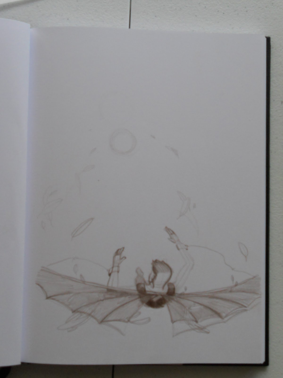
I use a brown colored pencil because it doesn't smear. I use brown because it is a warmer dark color and is good for shading.

*This image is from my sketchbook which I transferred directly onto the prepped illustration board.

#3
Prisma Color Pencils are amazing. I love using them because they blend beautifully. They have a great color selection and are rich in their colors. I haven't found anything better.

#4
Water colors are nice because they blend and unite the colors. They fill in minute areas that your pencil might have missed and start making the piece look together and complete.


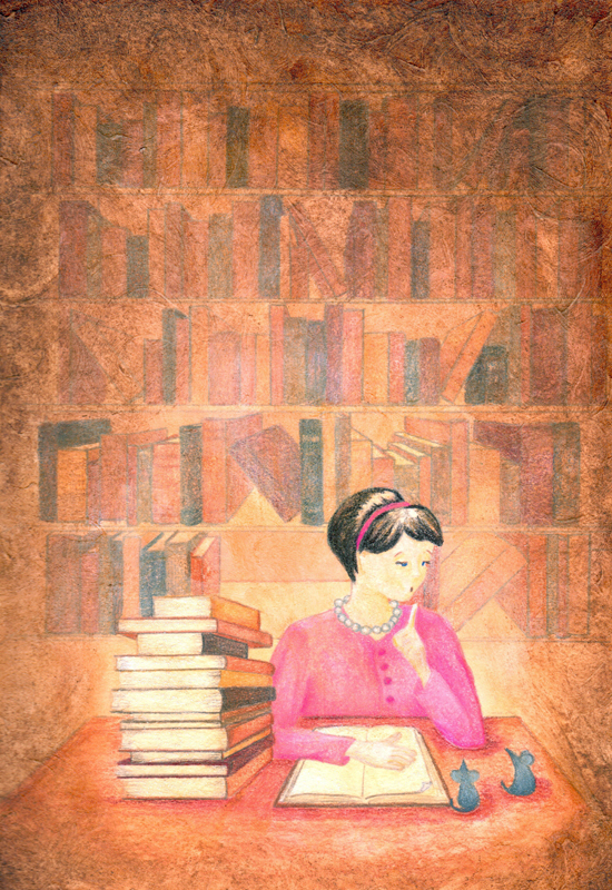
*This image is after I used +Prisma Color Pencils and then a layer of watercolor.

#5
Just spray a thin coat of this acrylic fixative, you don't want the pencil to bleed or the watercolor to run when you apply the mat medium and gesso.

#6
I apply Liquitex Clear Acrylic Gesso and Liquitex Matte Medium Medium Mat in an even ratio, with a little bit of water. This gives the piece the textured look. You can make the texture to your liking. You can apply it smoothly, with the brush strokes making a canvas look, or you can go swirly.

Make sure the entire piece is covered with whatever texture style you choose but, if you miss any little spot the next step might ruin your piece.

*I forgot to take an picture of this step, I was under a time crunch and completely forgot.

#7
Make an oil wash of the color you choose, this will unite your piece and make it look finished. Remember your warm colors and cool colors because this will affect the mood of you piece.

*I wanted this piece to look warm so I used a thin layer of "raw sienna" over the entire piece.

#8
If you put too much oil down, you can lift it off using a brush dipped in turpentine or a kneaded eraser. The texture you did in step 6 is now going to show, and that is a good thing.

#9
The "raw sienna" was good, but a little too brown. I wanted more yellow, so I used a Prisma Color Pencil, "Canary Yellow" over the sky area. I was also added some additional highlights and shadows, adding more depth to the piece.

#10
When you are satisfied with your work, you can peal off the taped edges. It's fun to do and it looks amazing!


*Sometimes I switch up steps 3 and 4 drawing and watercolor, it depends on the piece. I really have noticed a difference though when I leave either step out. Both are vital in making the piece have depth. The colored pencil gives texture and detail, and the watercolor brings the colors together.

*If you like how your piece turned out you can stop after the watercolor. However I noticed that the illustration looks more complete when you can bring it together with an oil wash. If you are going to do an oil wash, you have to put a protective layer over your piece.


Thursday, February 7, 2013

Black Hawk UH-60

Black Hawk UH-60


I was very excited to receive this commission request. My husband is in flight school and is training to fly a Black Hawk UH-60, one of his friends saw some of my work and asked me to paint him a Black Hawk. The client was very easy going and great to work with; after I showed him some color sketches he chose to go with the silhouette in the night sky.

Favorite Part
I love the sky! I am really pleased with the blending, the stars and the Milky Way that is almost hidden in the sky. I love the contrast from light to dark. I didn't use any black, the darkest color is a Prussian Blue.

Toughest Part
The Black Hawk itself was the toughest part, it is very technical and precise. I would almost equate it with drawing a person. Everyone knows exactly what a person is supposed to look like, because we have looked in a mirror. Pilots are the same way with what they fly, they know their "bird" inside and out. Every little button is important and I needed to be just as precise.

I was very excited with how this turned out, and I my client was seemed just as pleased; if not more.

Wednesday, February 6, 2013

Wheel


The word of the week, "Wheel".
I used colored pencil, watercolor and oil.
 
Favorite
My favorite part is the composition and colors. I love the colors with how warm it looks, and I like that your eye moves around the piece.
 
Changes
I was hard to choose the final layer of oil. I debated between a Cadmium Yellow Medium, Burnt Umber, or Yellow Ochre. I ended up going with the Yellow Ochre and just a little of the Burnt Umber in the upper half. Burnt Umber is really dark and I was a little scared to put it on the entire piece.
 
Finished
And looking at the piece now, I think that the a darker layer would not have shown the sunset as much as it does now. The colors would be different and I really like the colors as they are now.  
I am still really pleased with the finished product. I like the colors and composition. I think it turned out well. 

Friday, February 1, 2013

Gallery Thoughts and Process


I just finished taking down my pieces at my first art gallery, The Dowling Museum/Anne Rudd Art Gallery. It was such an amazing experience and I learned so much in the process.


Gallery Prep Time
8 hours: Front window display
10 hours: I spent an entire day cutting mats and framing pieces, besides previously framed pieces.
2 hours: I took all the pieces and layer them out on the floor of the gallery to see where they should be hung.
15 hours: Hanging the pieces and setting up.


The most shocking part of the process for me was the hanging time. It only took me 2 hours to lay the pieces out, I thought that it would take 4 hours, 5 hours tops to hang all of the pieces. The leaves took the longest for me to hang. I should also say that "me" hanging them was actually my husband who graciously helped me with those. They are hung on a wire and look like they are "floating".


The other pieces were easier because they did not have to be as precise. I was able to hang those quicker, but I rearranged them several times before I was satisfied.


Opening Night:
What a great evening! Lots of friends, lots food, and lots of fun. It was great to be able to talk with people and explain your work. I was so busy I didn't even get to take pictures.


Tear Down:
It took me a grand total of 2 hours to take everything down, load it up in my truck and clean up. It was such a good experience and I cant wait to do it again. I wanted to say thanks again to the Dowling Museum/Anne Rudd Art Gallery.